Burberry Website Redesign
This project shows the improved website layout for Burberry's website. Burberry's website for shopping/buying online was very flawed in terms of its UI and UX design, and had many aspects that could be improved. I aimed to fix these flaws the site had, and improve the overall UI and UX for it.
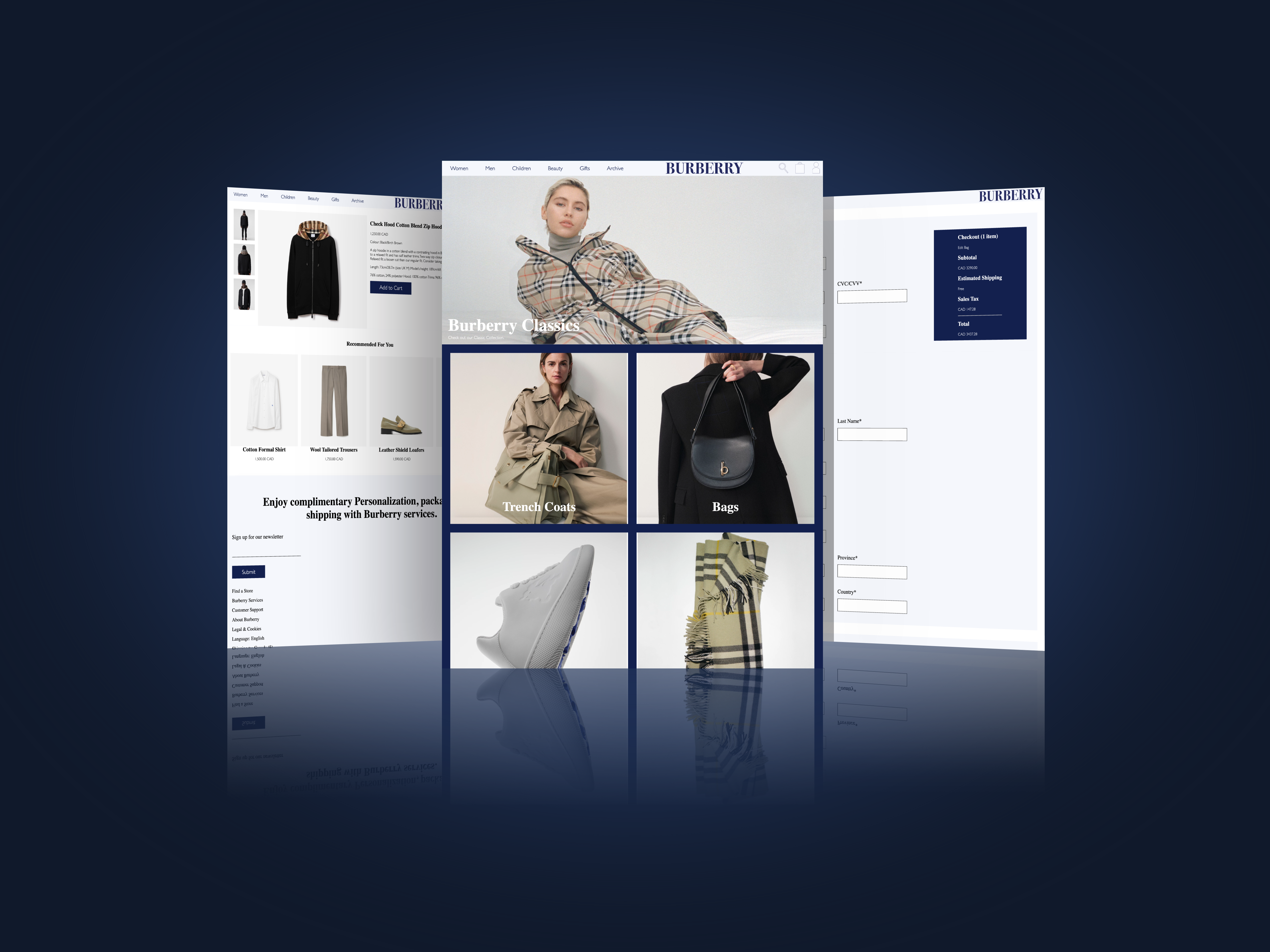
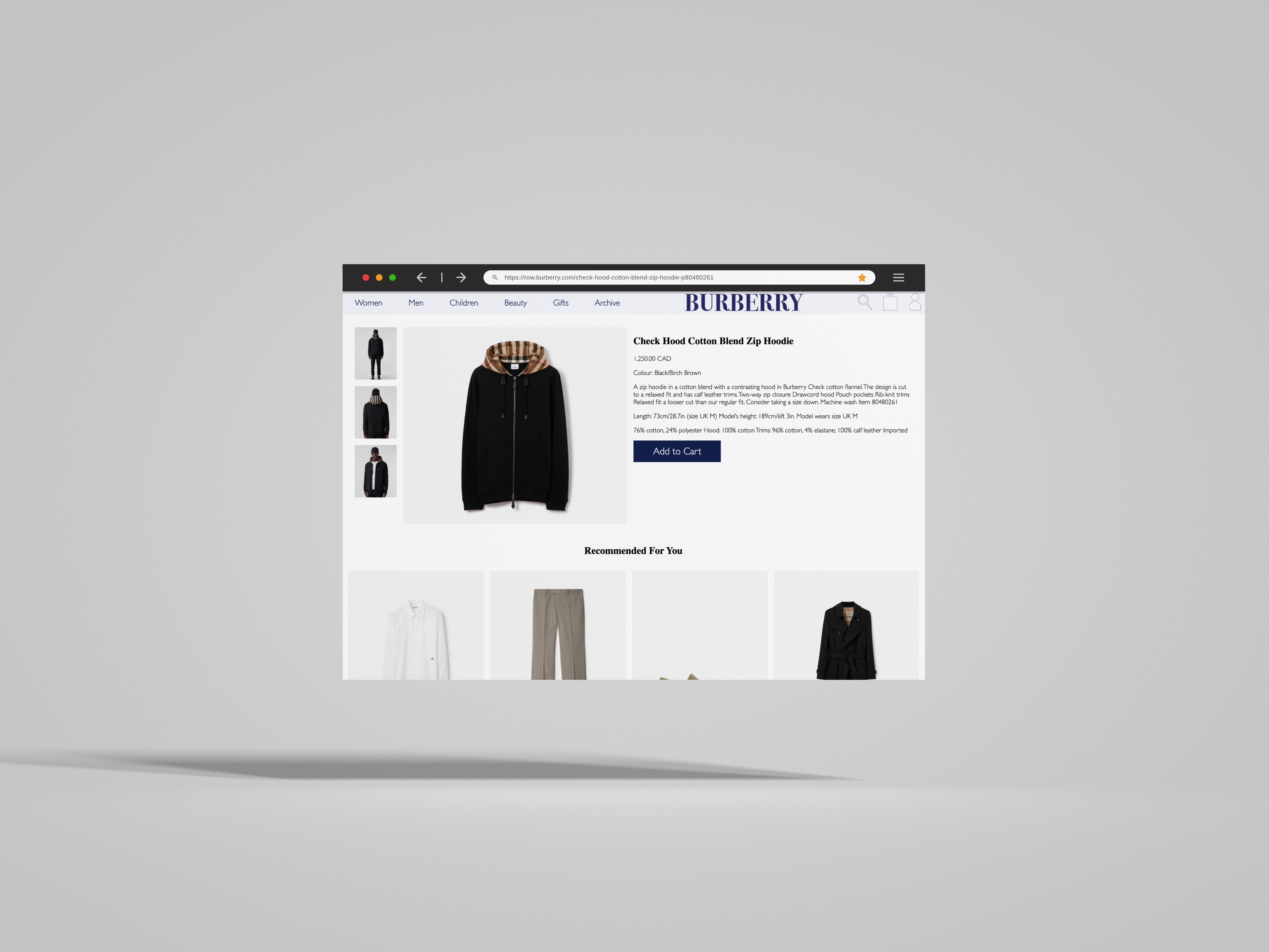
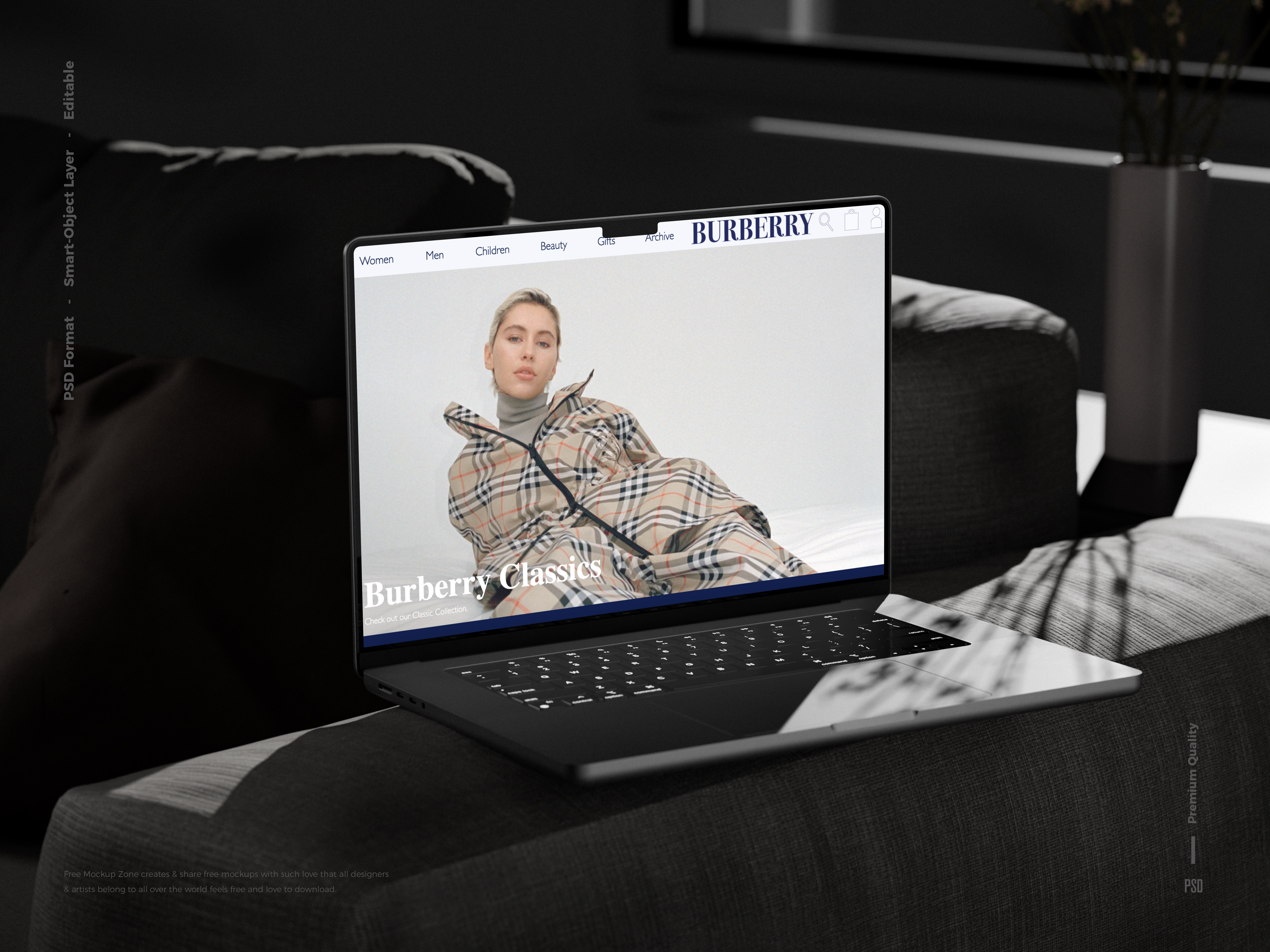
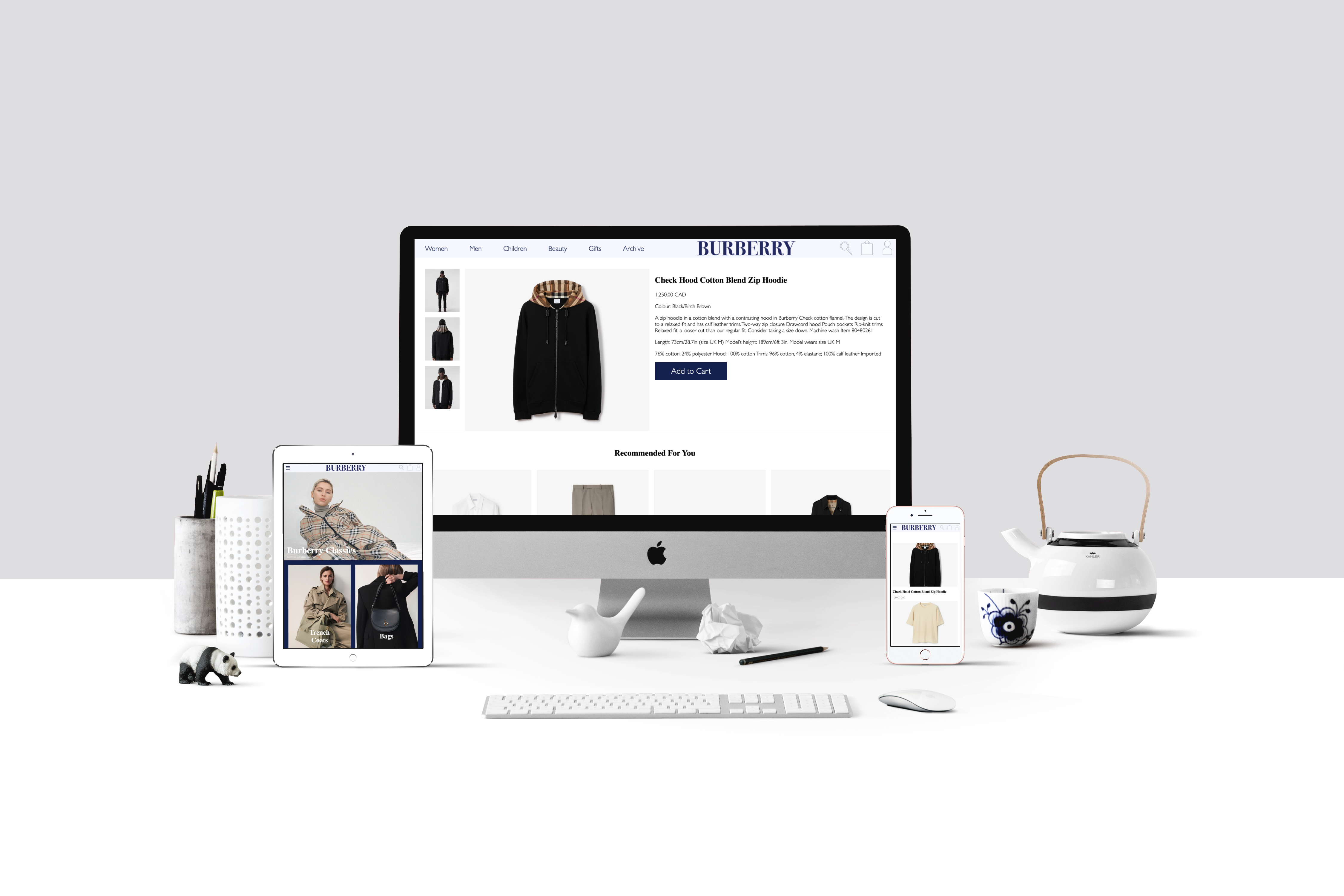
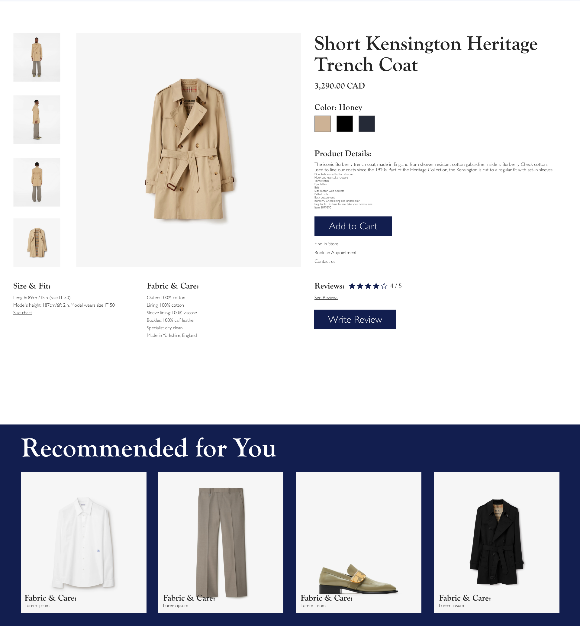
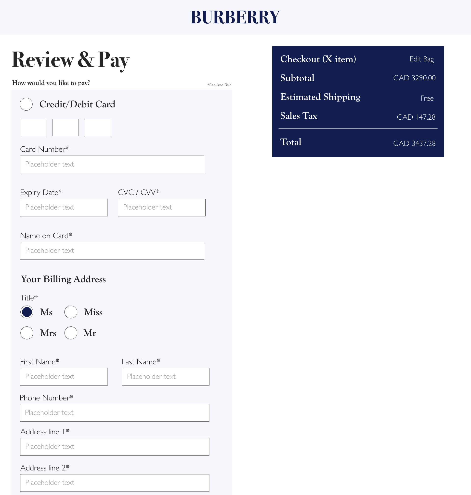
High-Fidelity Prototype (Desktop)
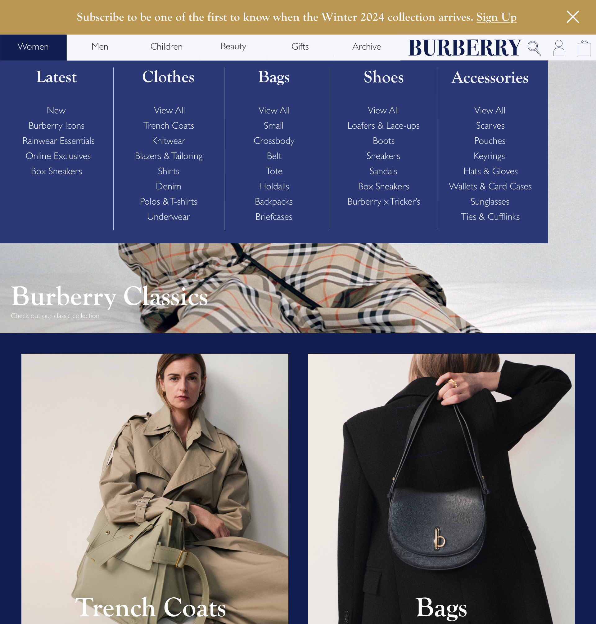
First, I had done research and investigated Burberry's website, noting all of the flaws the site had, that made it less UX friendly.
Some of these issues included:
- A transparent navbar with white text over an image, which sometimes made it hard to see the text in the navbar due to the image using light colors.
- A section with a lot of white space below the hero, which could be used to promote products instead.
- The dropdowns on the footer use the same font size and typography, making it hard to distinguish from the other fonts.
After noting down the issues that could be resolved, I then created the low-fielity wireframes for the site. I then adjusted and fixed some of the flaws that were present in the initial design, then turned it into a high-fidelity prototype.
High-Fidelity Prototype (Phone)
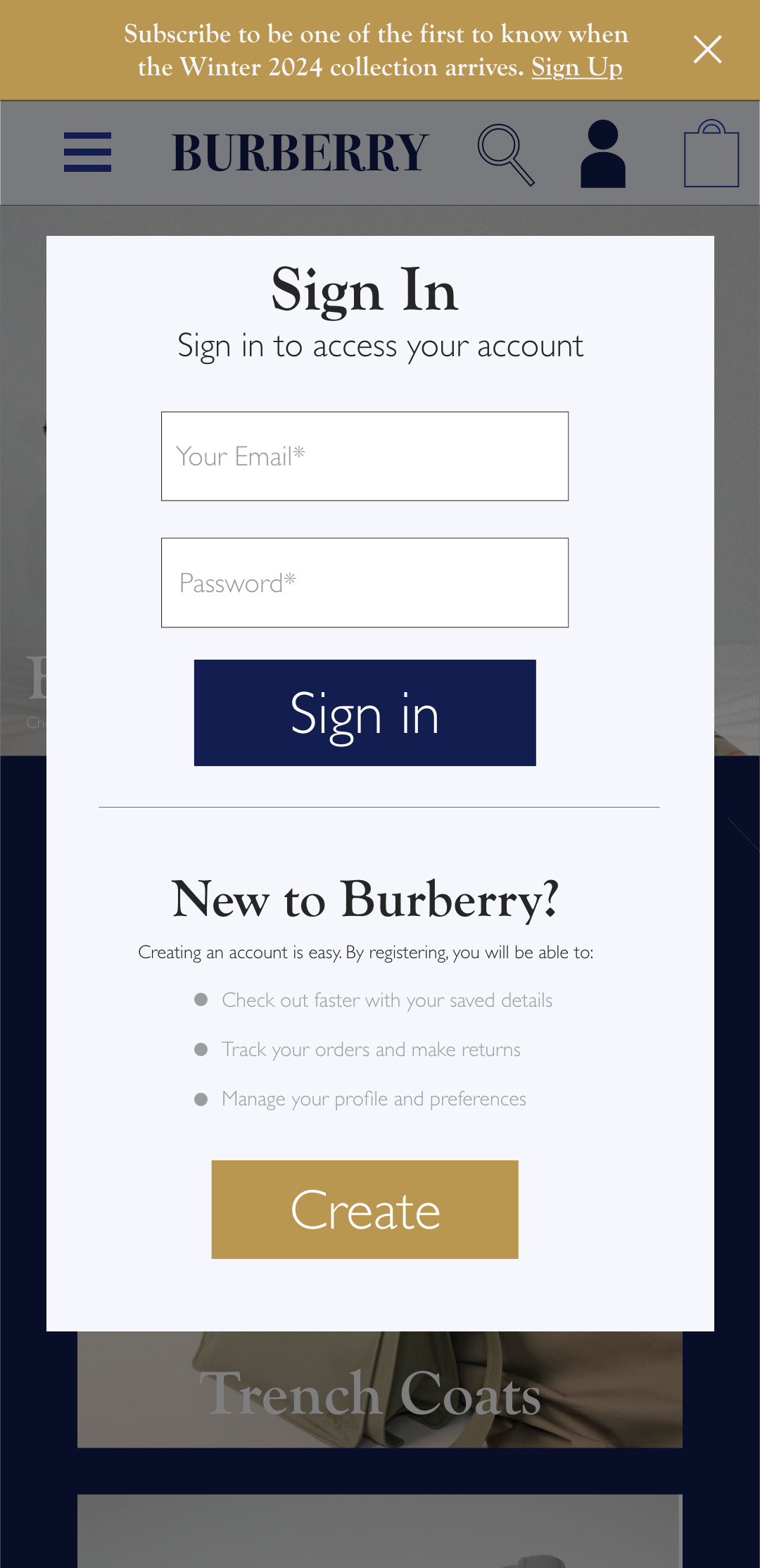
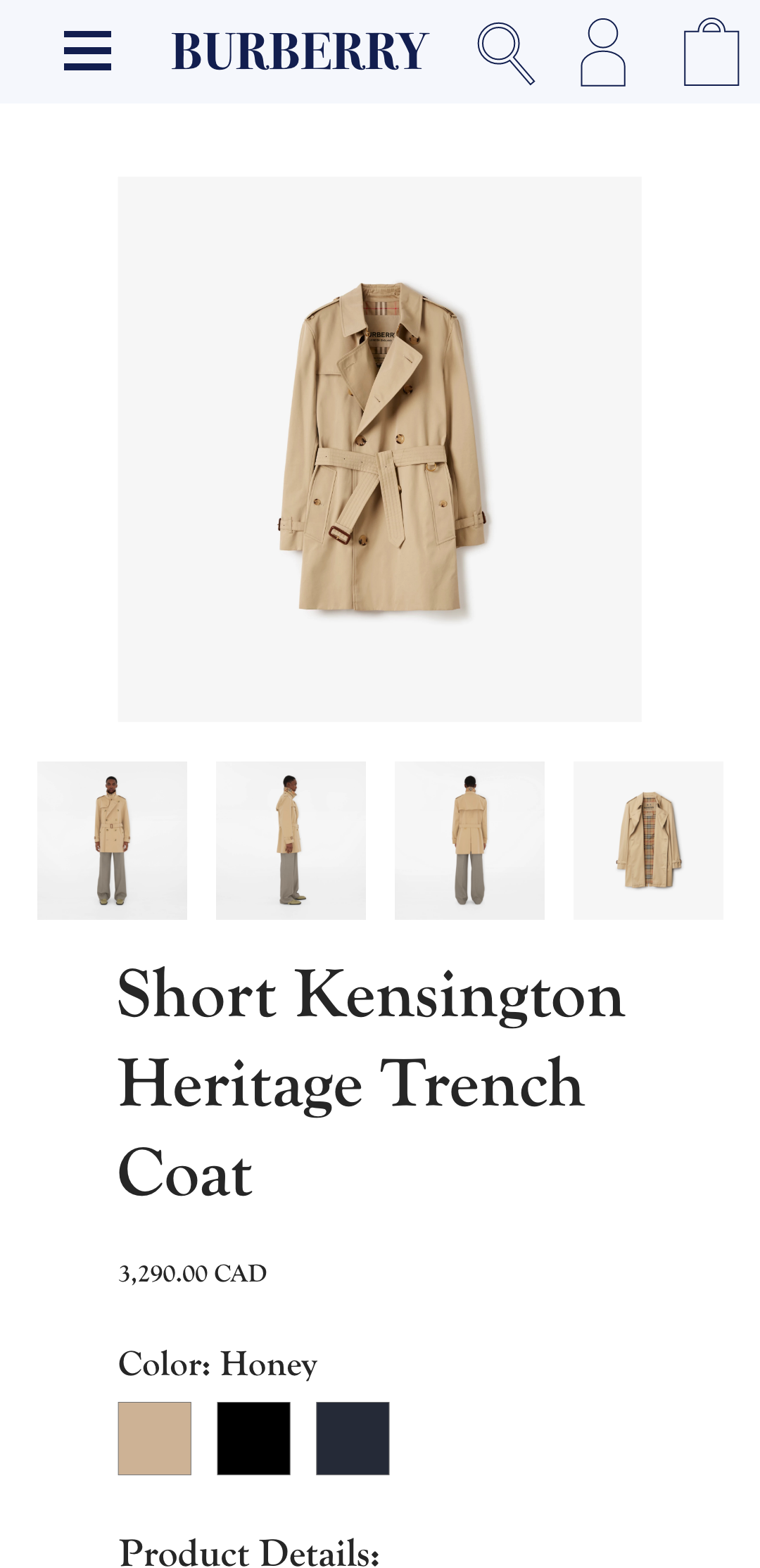
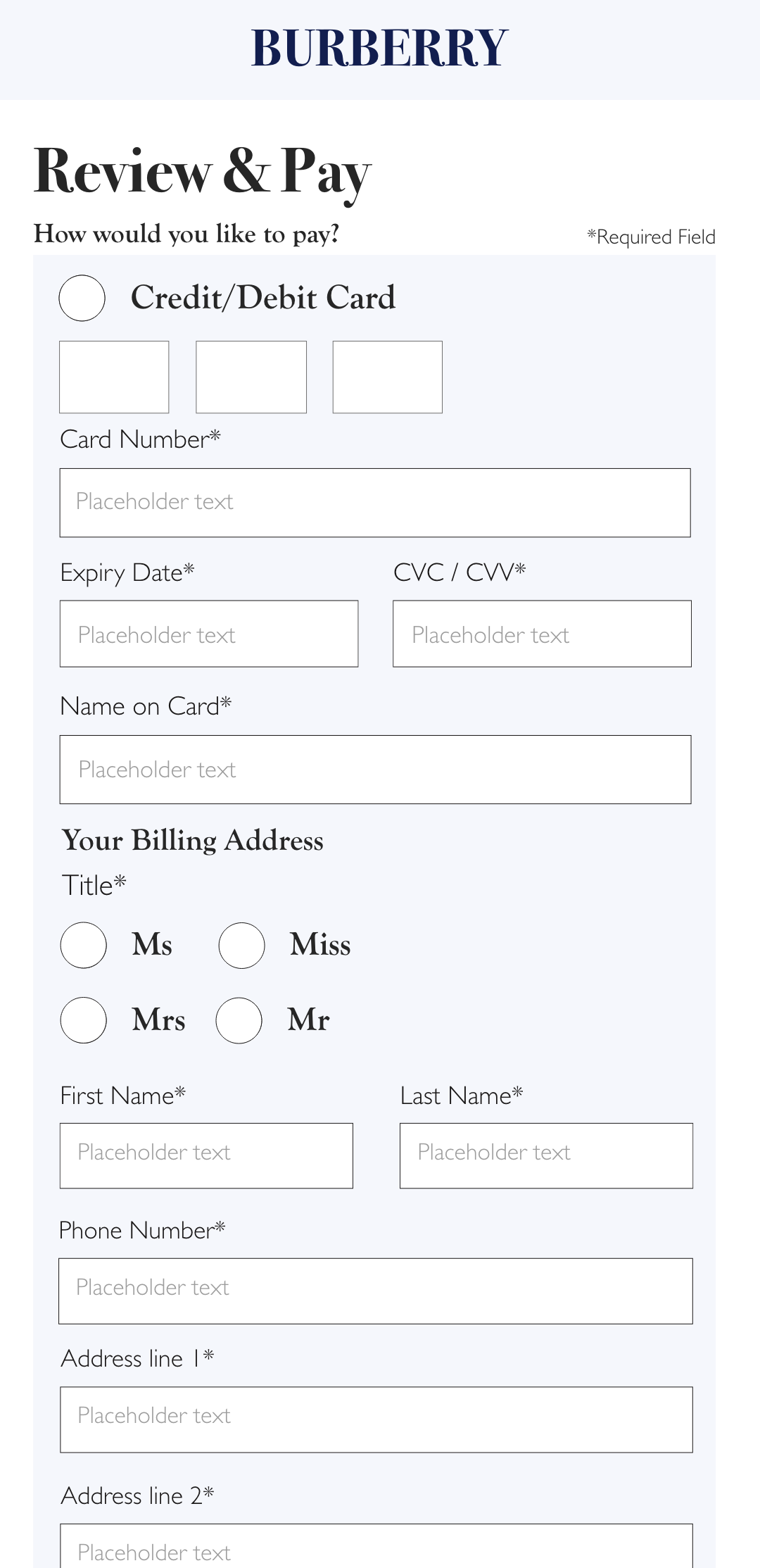
For the phone screen of the prototype, I translated the design of the desktop screen to the mobile screen, making the navigation on the side that was on the desktop into a hamburger menu that had multiple dropdowns, and revising the payment page to be more compact.
Conclusion
Overall, I think this project ended up ok, but I do think there are some major flaws with it, as while the UI is improved and more UX friendly, the overall design of the website could be improved, as it feels somewhat flat, and I do think that more pages/wireframes could have been added in the end to show more. In the end, this project was ok.
Mockups