.png)
Artinuity Project
This project shows the style guide, brand assets, and website layout for Artinuity, a fictional social media website that allows users to post and share different types of artforms, such as illustrations, music, and literature. The website is meant for artists to be able to thrive and share their art, while also experiencing what other users have made on the site, while feeling welcoming and friendly to people who are new, or more experienced.
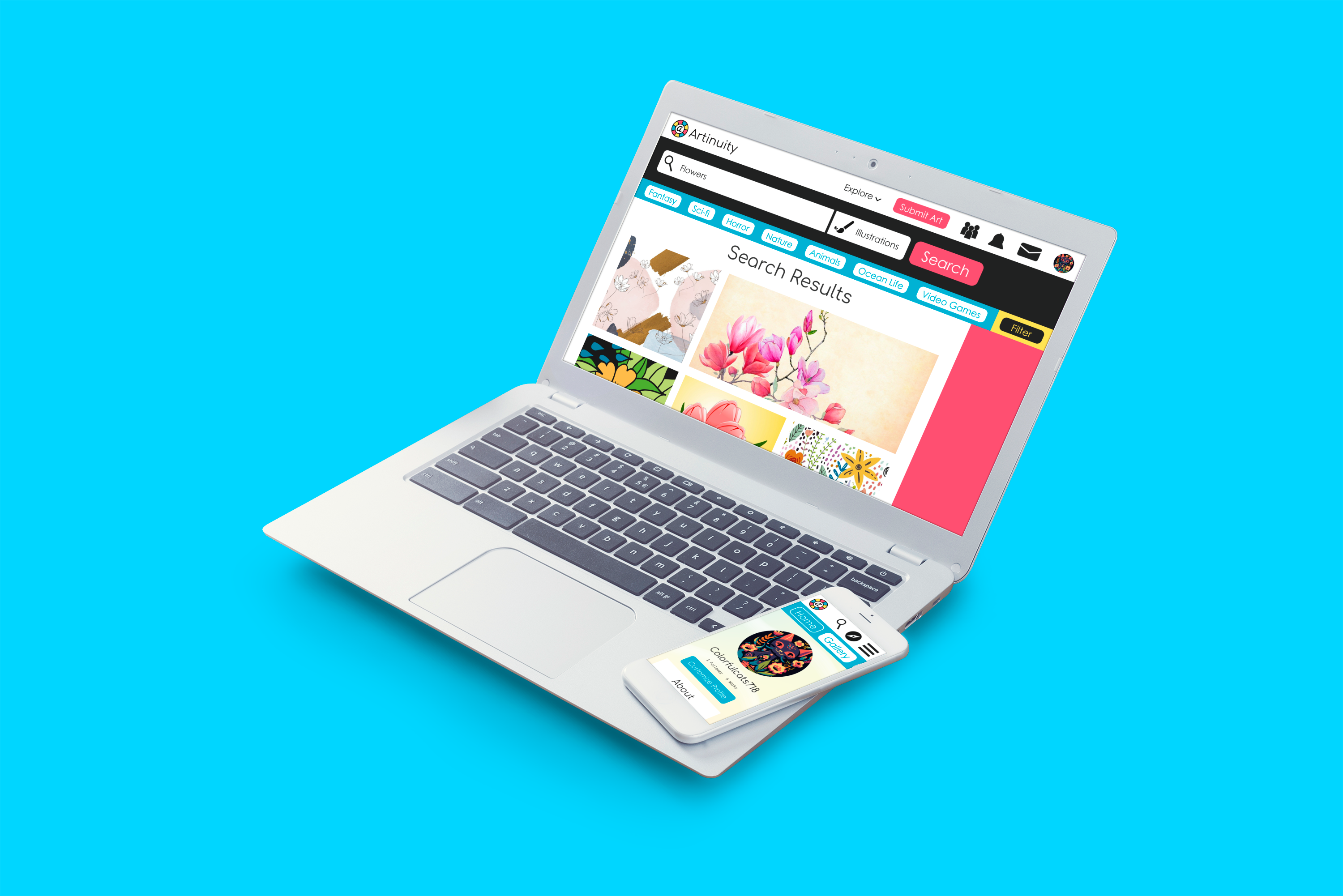
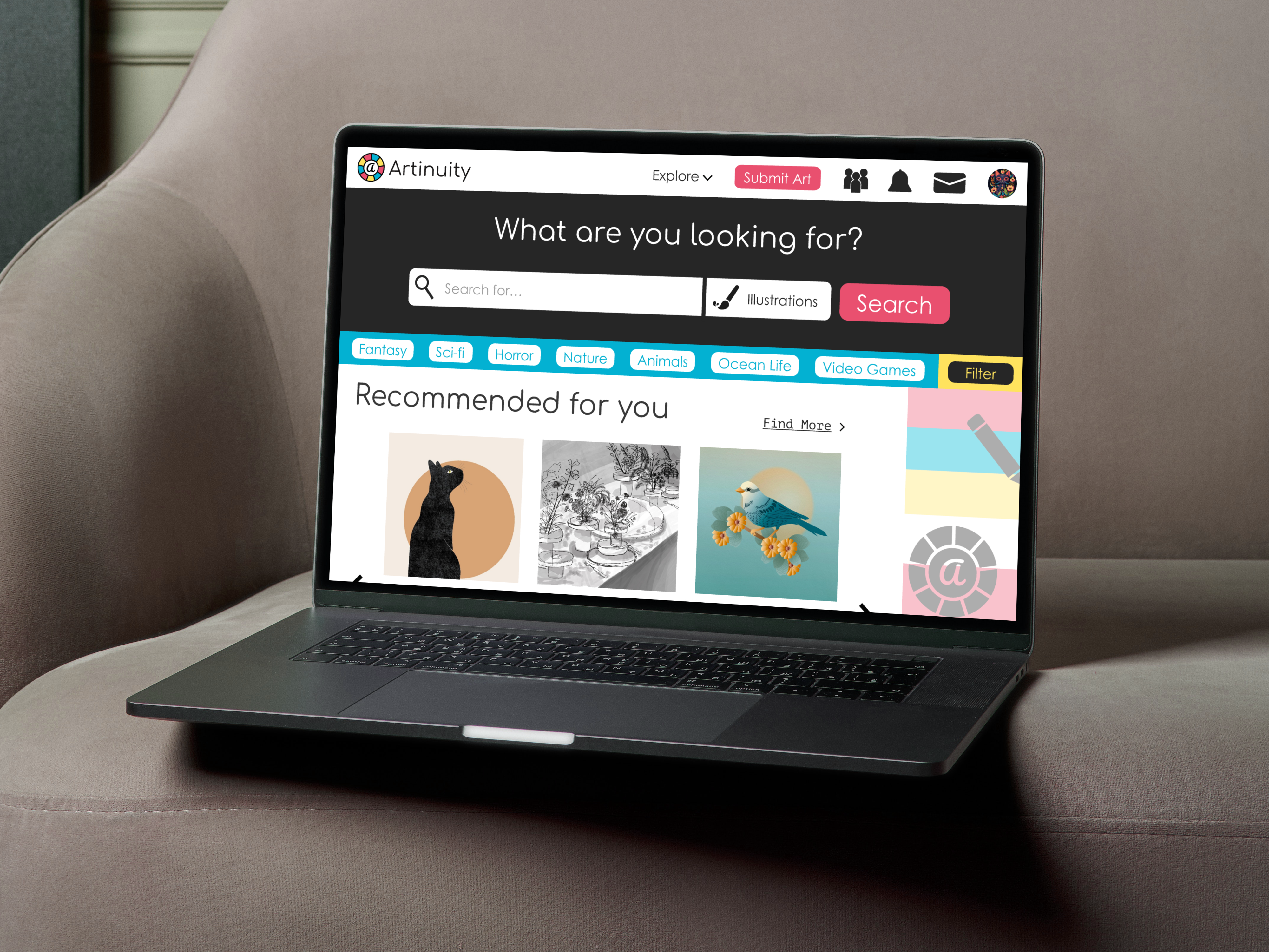
Website User Journey (Desktop)
When making the high-fidelity prototype for the site, I started with the low-fidelity wireframes of the prototype, creating the initial layout of what it would look like. After some feedback on the wireframes, I made revisions to the initial wireframes, and then turned it into a high fidelity prototype, adding images, brands assets, and interactivity into the prototype. After feedback was recieved for the high-fidelity prototype, I went back and made some readjustments to the initial prototype, including changes to the navbar.
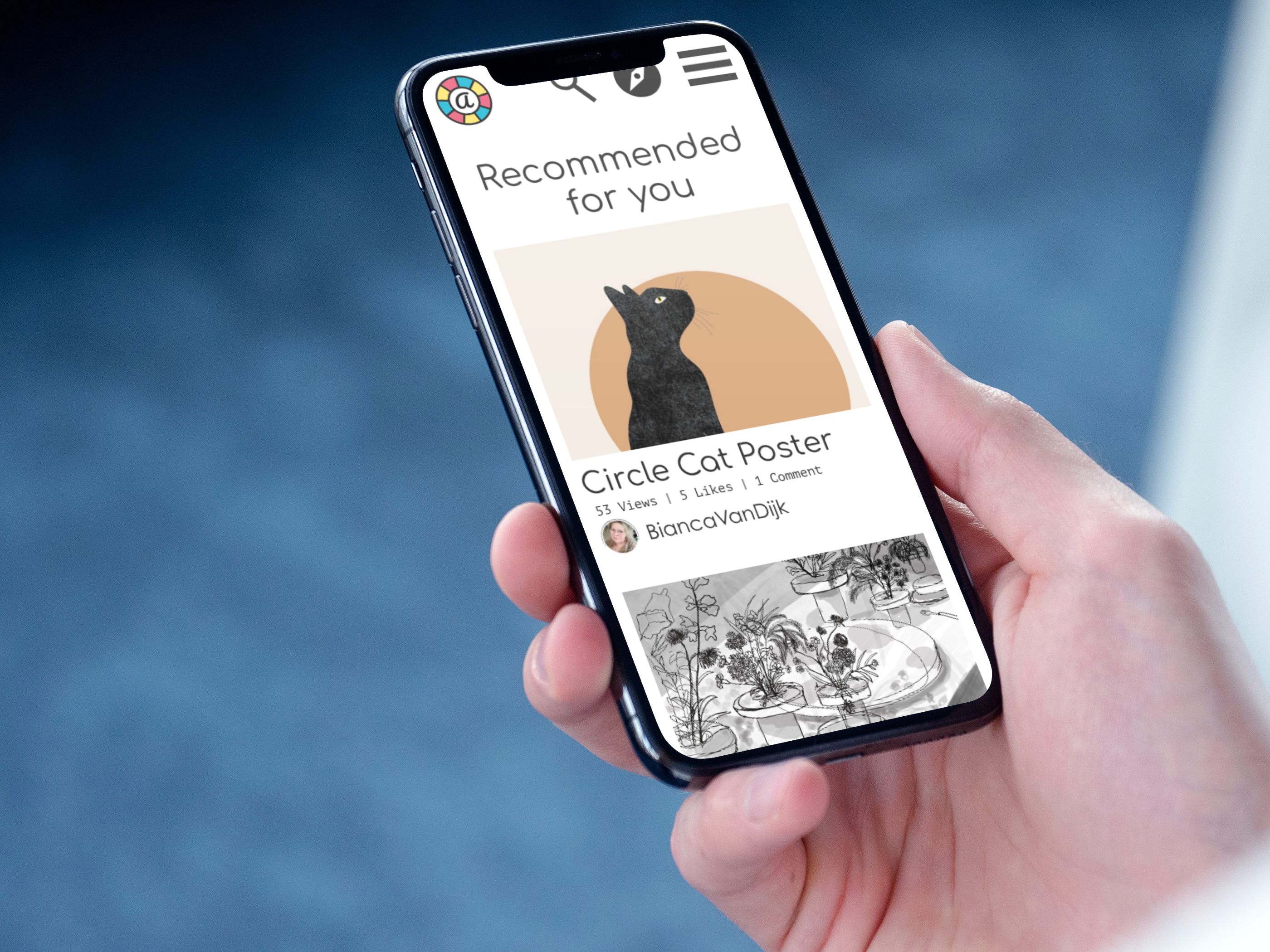
Website User Journey (Mobile)
When making the high-fidelity prototype for the mobile version of the site, I first created the low-fidelity wireframes for the prototype, creating the inital layout of what it would look like, trying to translate all the components from the desktop screen to a mobile phone, then I turned it into a high-fidelity prototype, adding the same images, brand assets, and interactivity from the desktop screen, and after some feedback, went back and made some slight revisions to it.
Style Guide
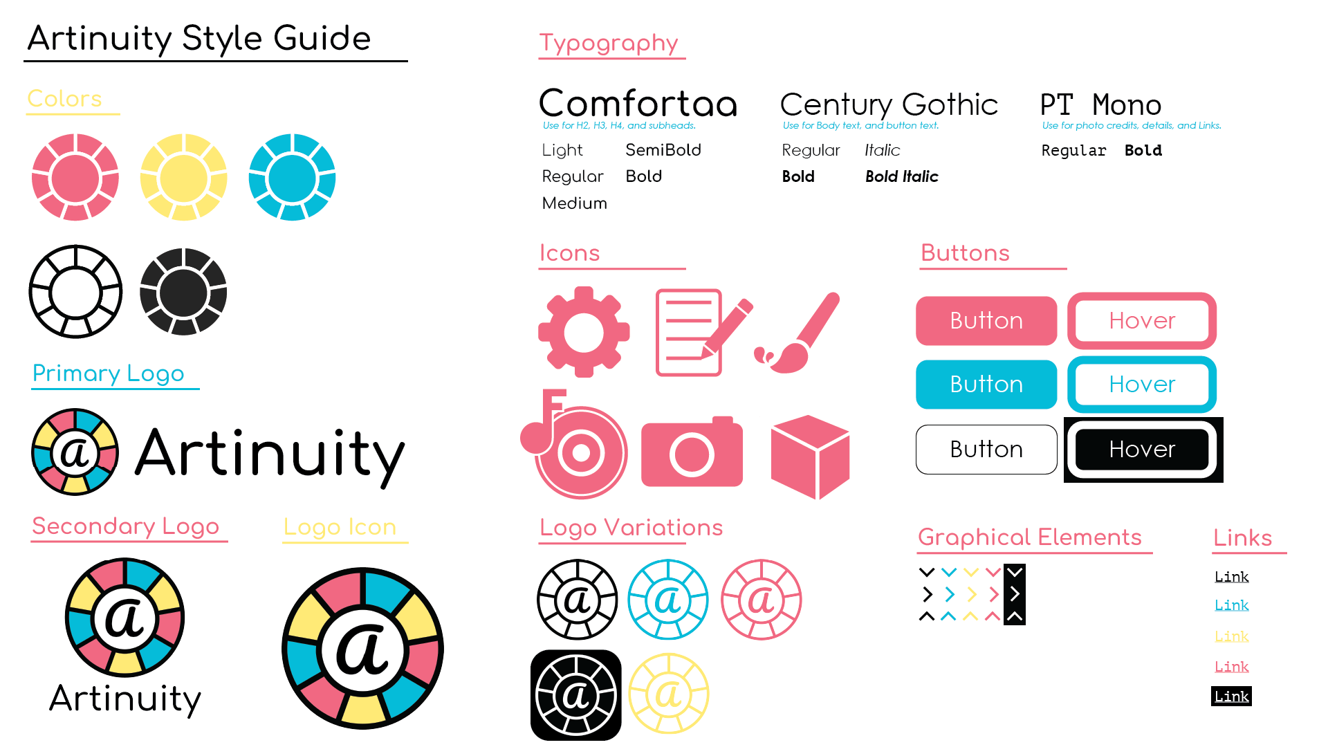
For the overall style of the branding and website, I wanted it to feel welcoming and friendly, while also being casual, lighthearted, and optimistic, so that newcomers or users who never used the site won't feel overwhelmed or anxious. I went with some slightly desaturated bright colors to help give it a friendly and optimistic atmosphere while still feeling welcoming, and some sans serif fonts plus a mono font to make it feel casual and chill. I also tried to make the graphical elements reflect this, by trying to not make them feel like they're too overdetailed or complicated.
Advertisements
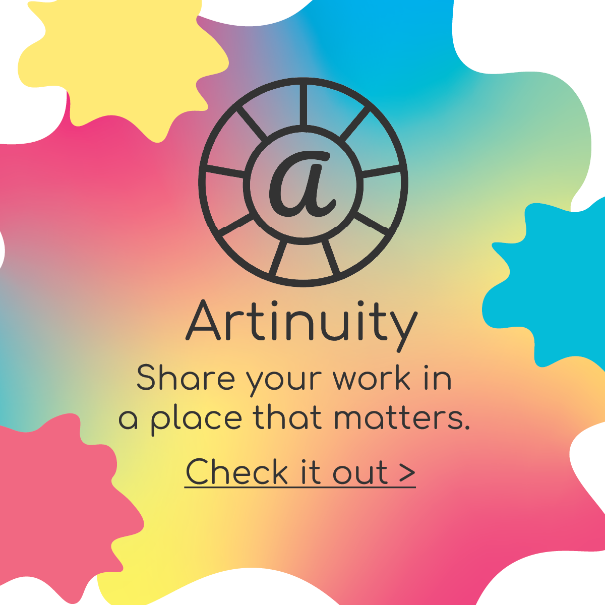
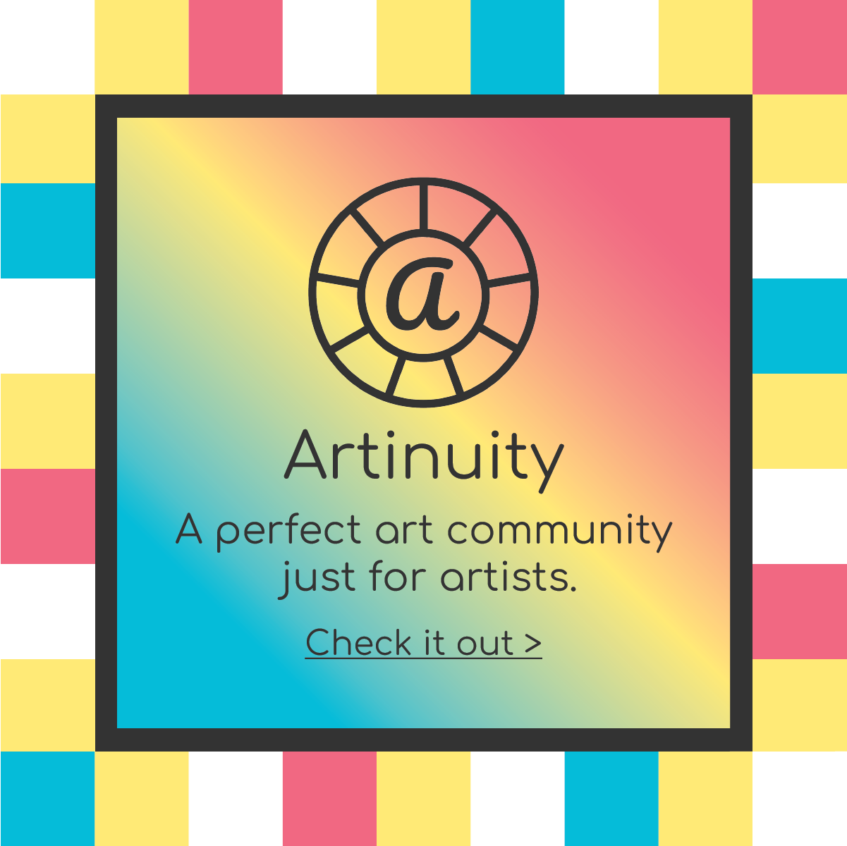
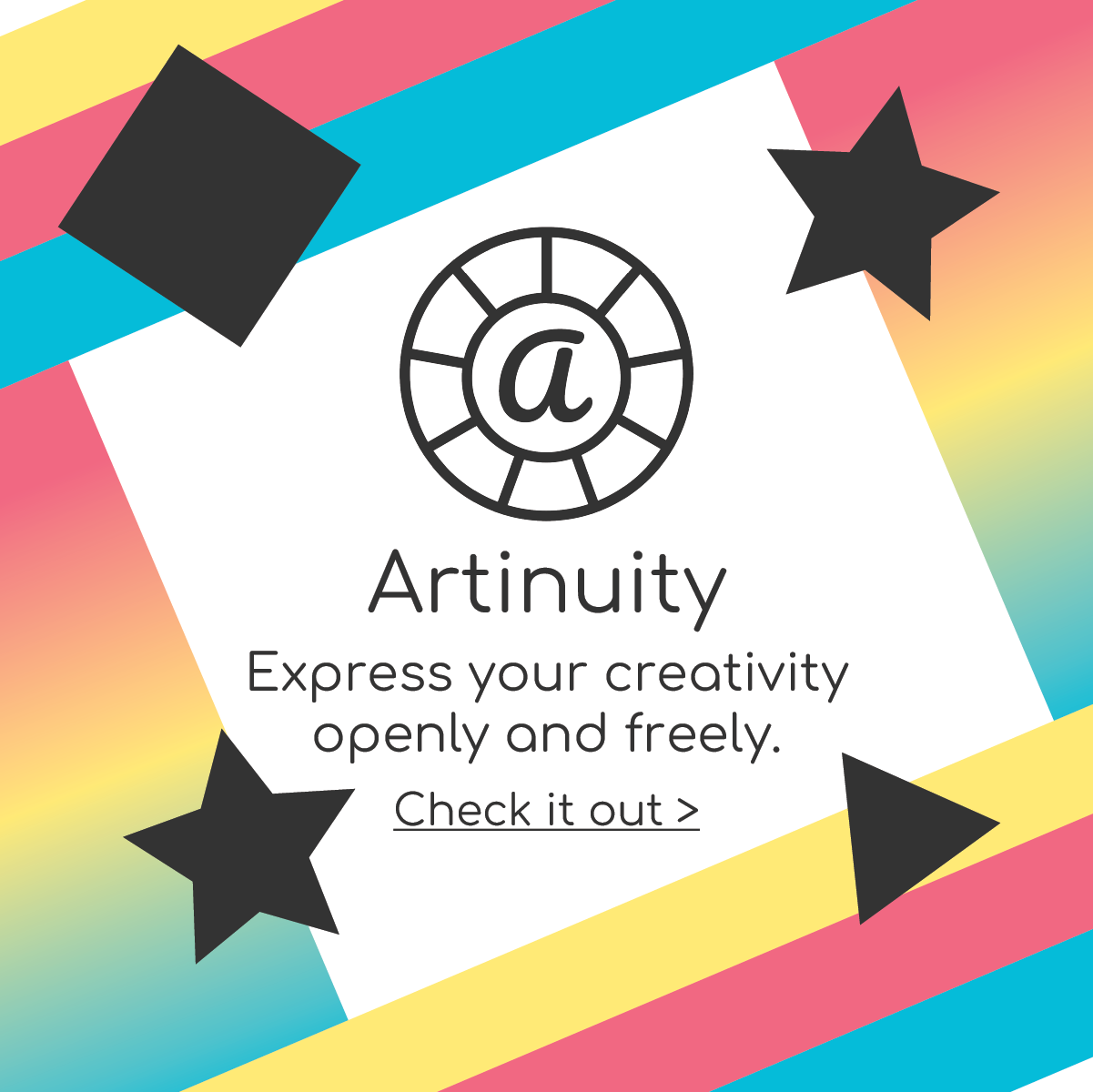
For these advertisements, the initial idea was to make them display/reflect different art forms, but after feedback I ended up not going through with the idea, since the ads would become too different and inconsistient from eachother. I had wanted to make them match with the tone of the project, and make them match with the art part of the website as well, while making them abstract. After some experimentation with the design of them, I ended up with these three, which somewhat matched the overall tone and focus for the website, while still feeling cohesive.
Background illustrations
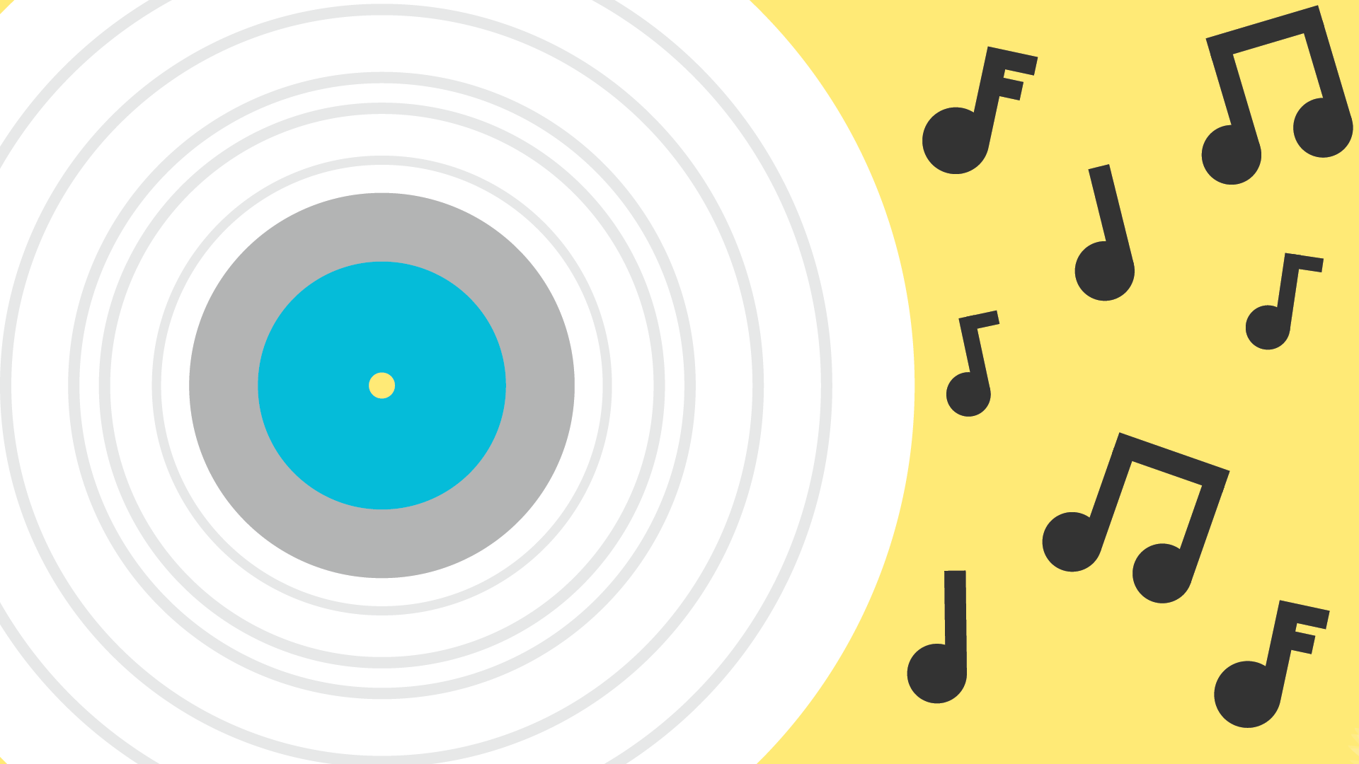
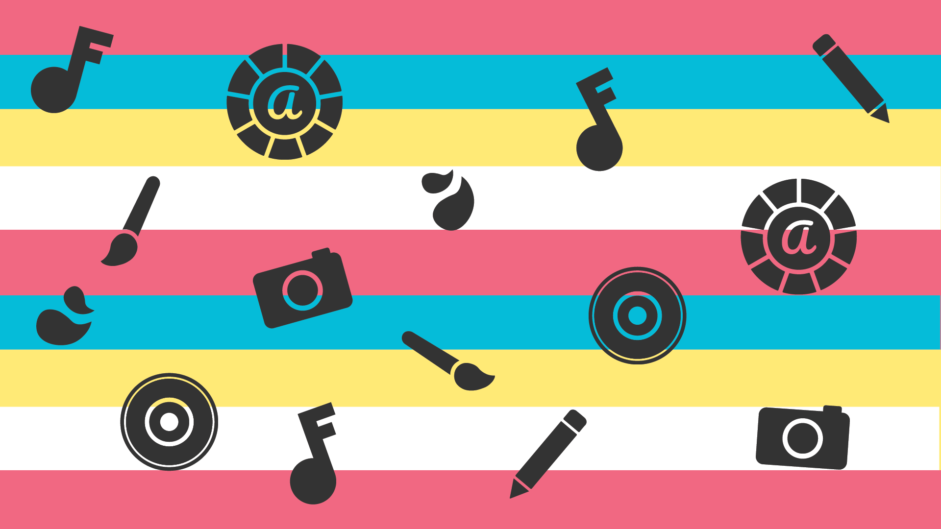
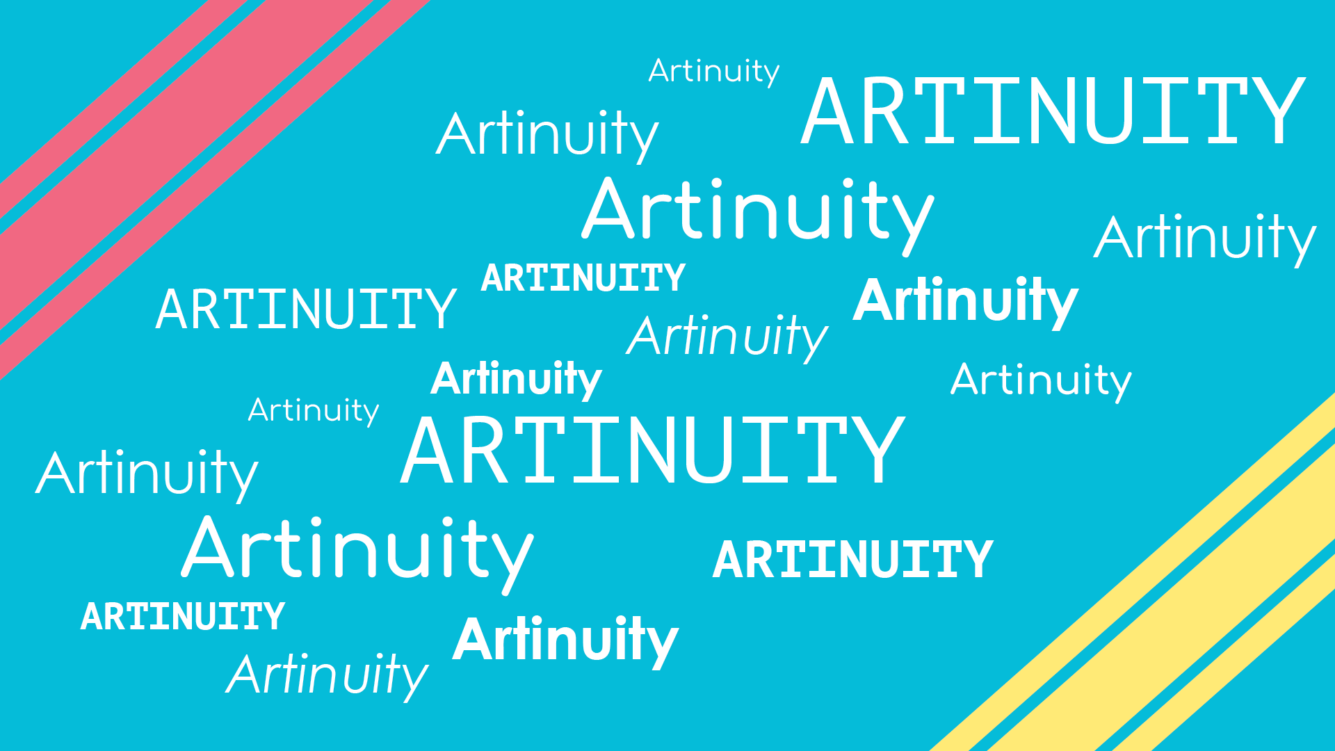
These illustrations are the backgrounds for some of the pages on the site, so I wanted to make these illustrations based around different artforms depending on the page that the user was currently on, while also being cohesive with one another in terms of their design. I ended up making 3 different ones in total, with the one for the music page, having a white vinyl disk and music notes on the side to show its related to music, one for the home page, with different icons against a color background, and one for the literature page, which includes typography of the site's name messily arranged.
Logo Sketches
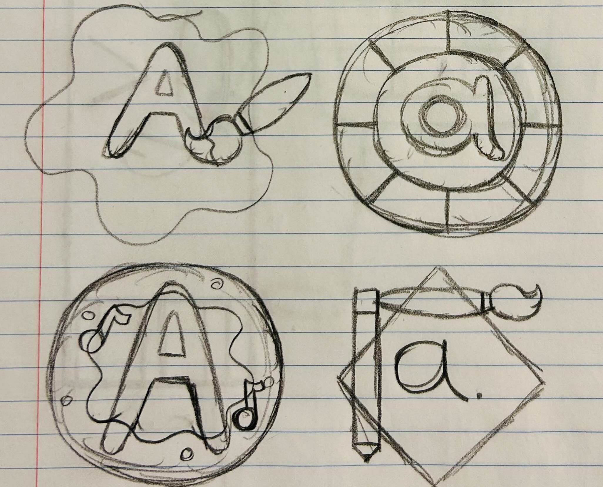
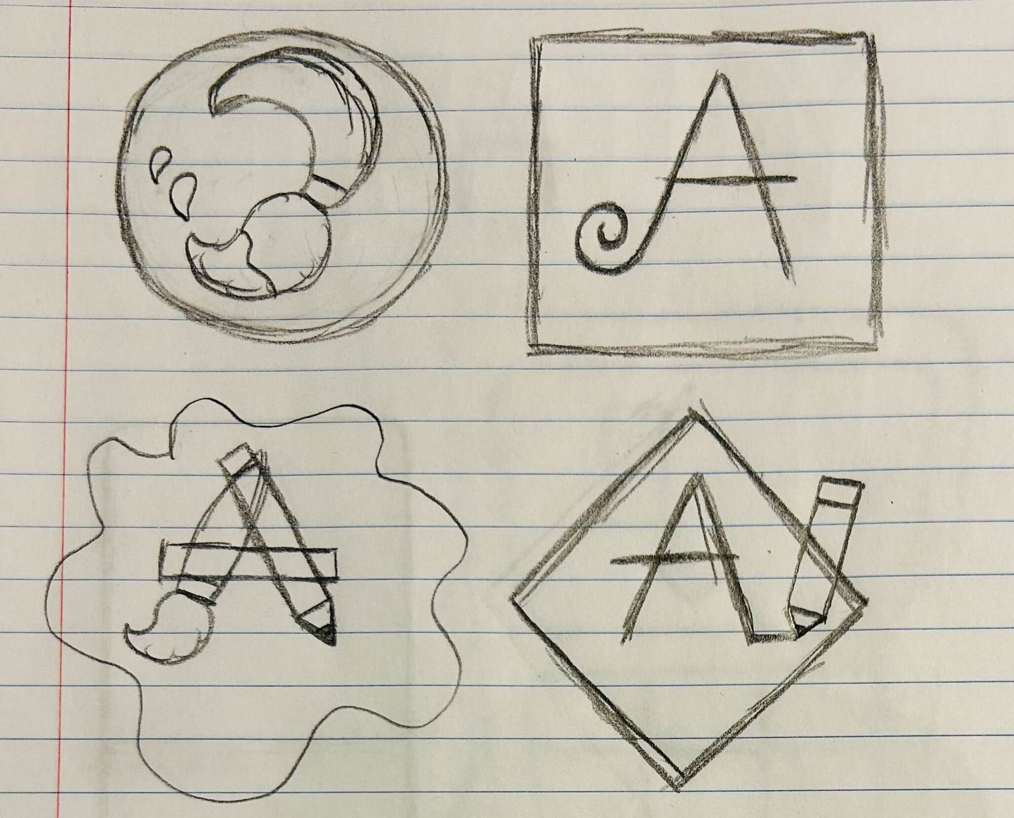
When sketching initial idea of the logo, I wanted it to lean more into the art part of the website, so I created some logos that reflected this, with some including a paintbrush or other art tools, and a paint splatter. I then realized that those logos felt too overcrowded and complicated designwise, and tried to make more simpler ones. Eventually I settled on a logo that felt unique while not being too overcomplicated with a lot of details, as shown in the style guide.
Conclusion
While most parts of this project were fairly smooth, the most challenging aspects of it were the high-fidelity prototype, as it was tough trying to think of how do the layout for the website's UI, and trying to find as many images that were needed to incorporate in the prototype, that were related to the topic of the website/prototype. Despite those challenges however, I am satisfied with how this project has turned out.
Mockups