Zara Website Redesign
This project shows the improved website layout for ZARA's website. ZARA's website for shopping/buying online was very flawed in terms of its UI and UX design, and had many aspects that could be improved. I aimed to fix these flaws the site had, and improve the overall UI and UX for it.
High-Fidelity Prototype
First, I had done research and investigated ZARA's website myself, to find all of the flaws that the site had, and noted them down.
Some of the issues I had found for the UI of the site, was:
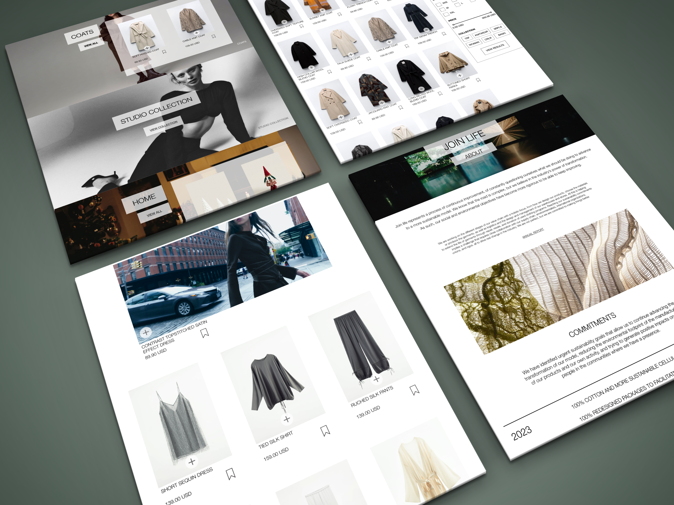
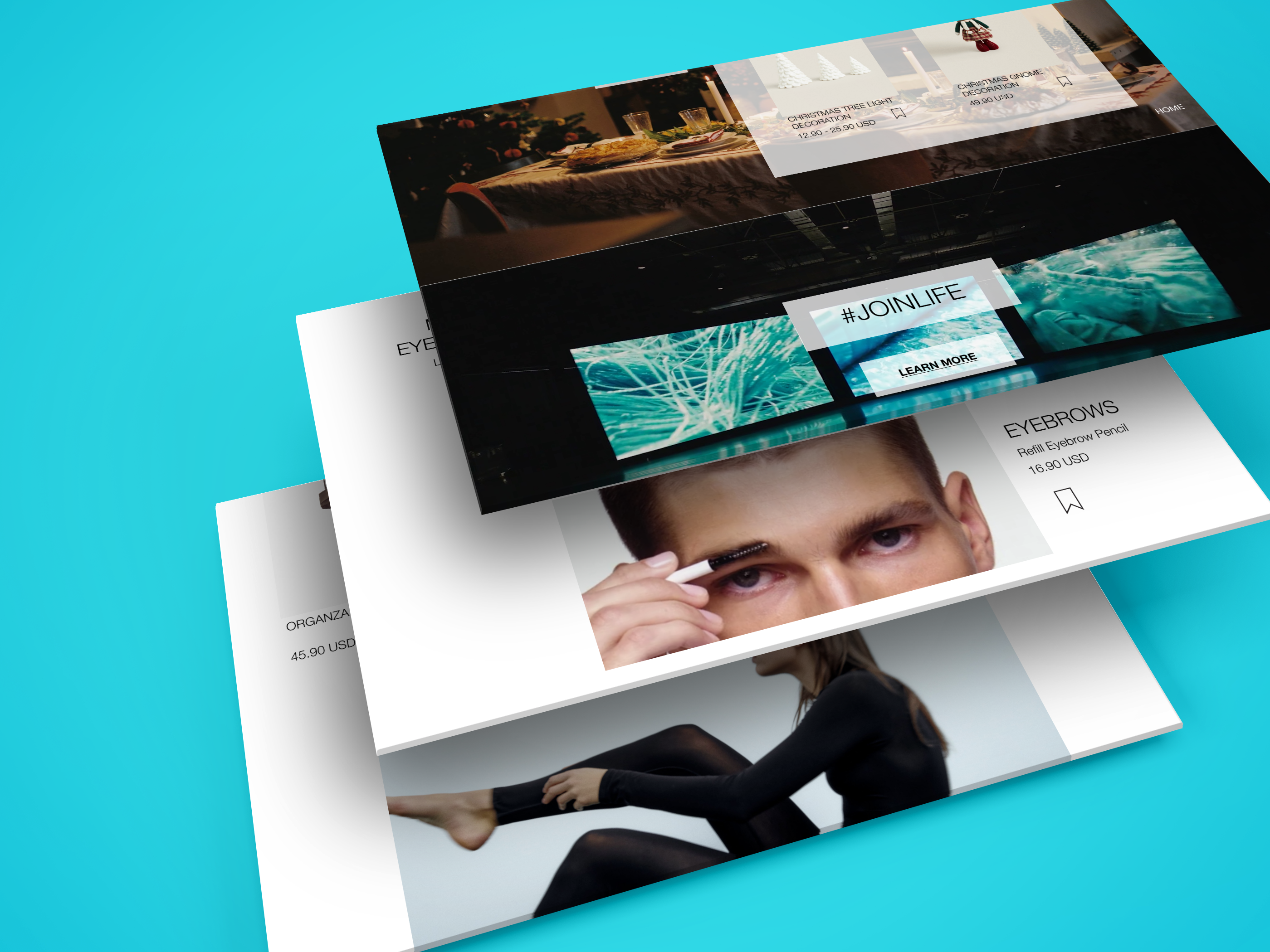
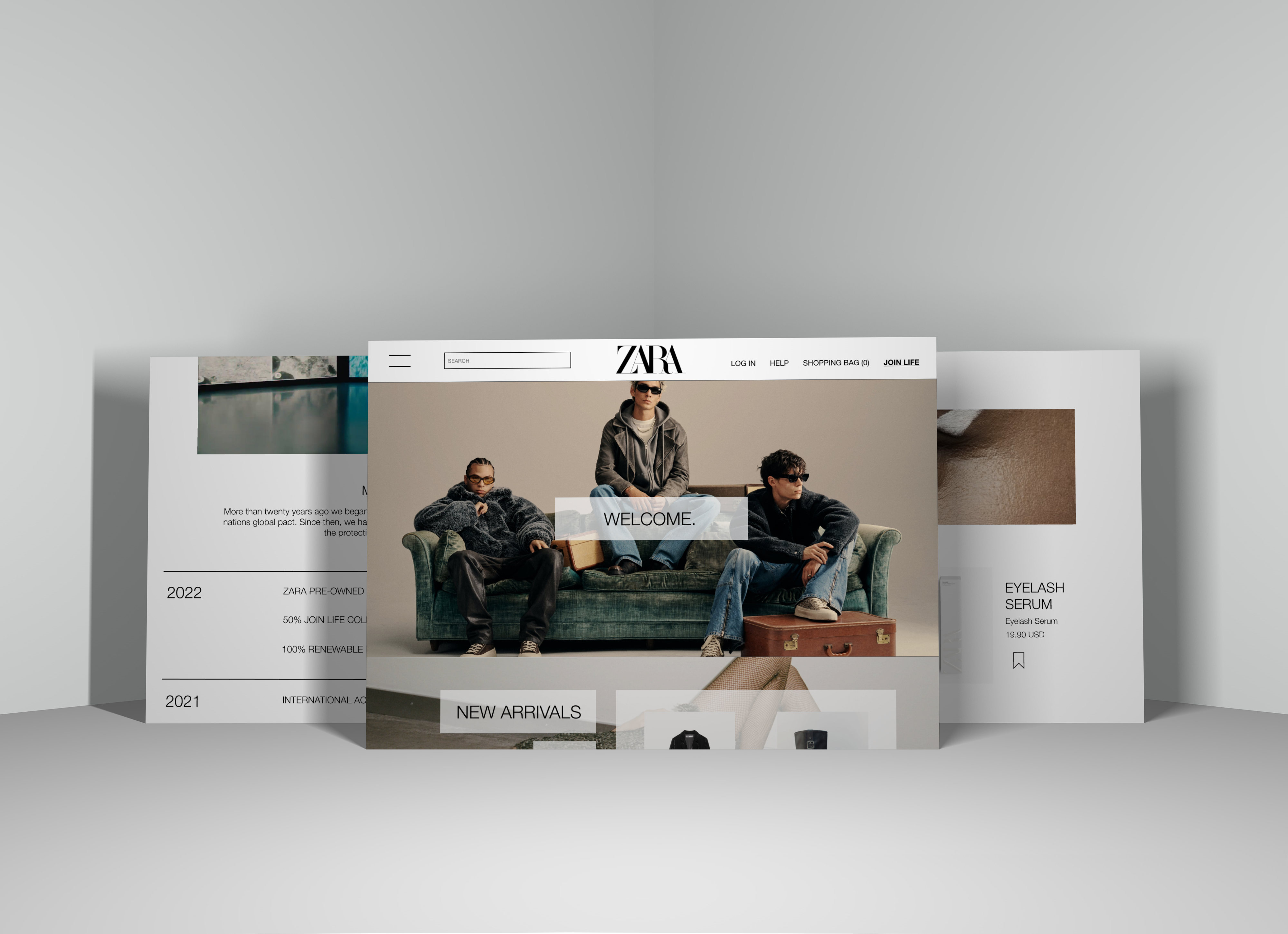
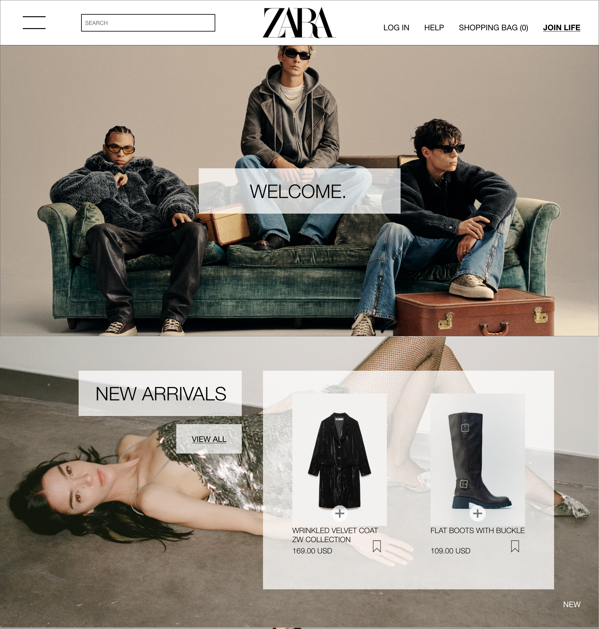
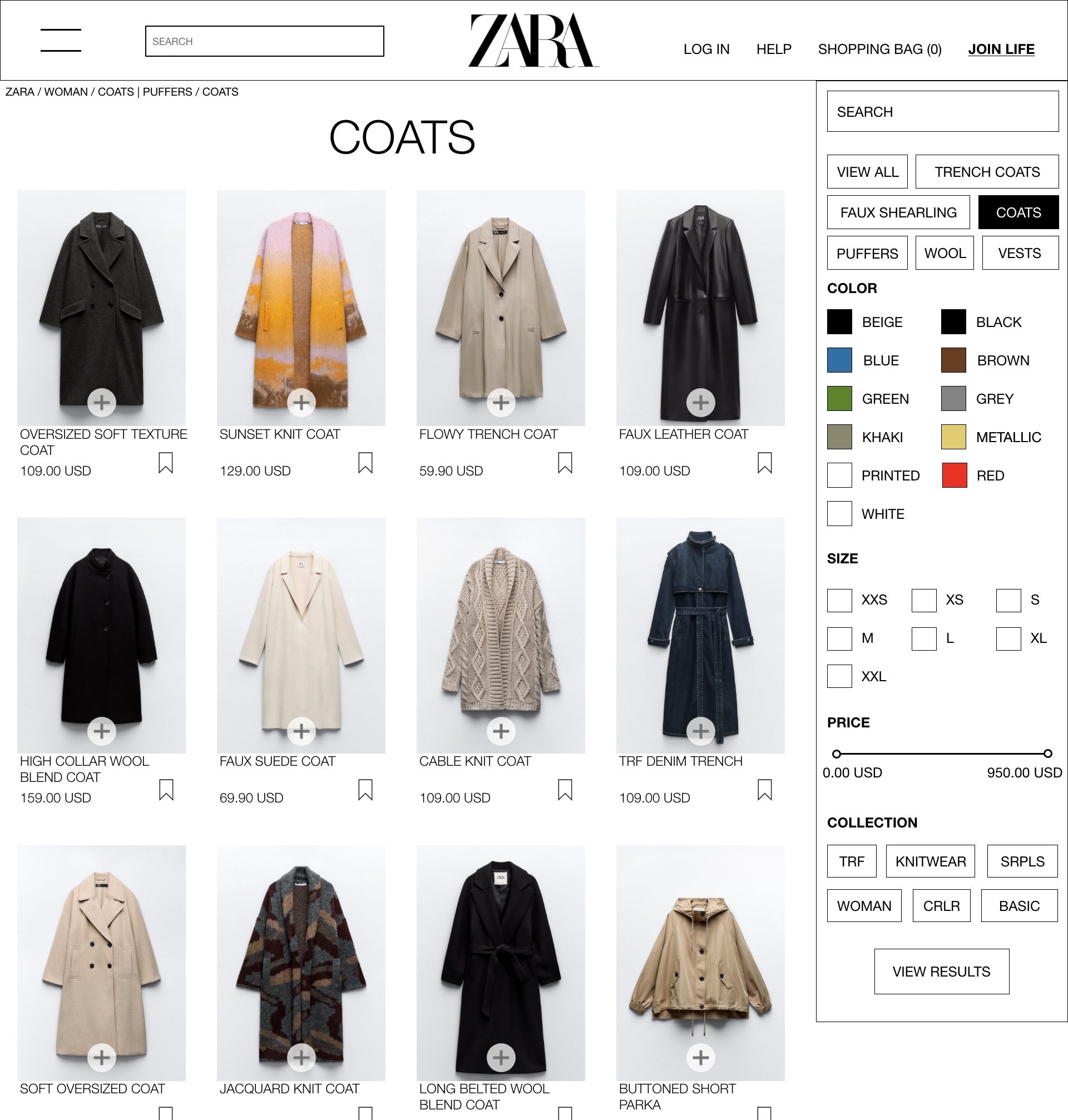
- The initial navigation for the website wasn't well optimized, with the dropdown being fairly disorganized.
- The filter for their e-commerce pages appears inconsitiently, which can make it harder for the user to find what they want.
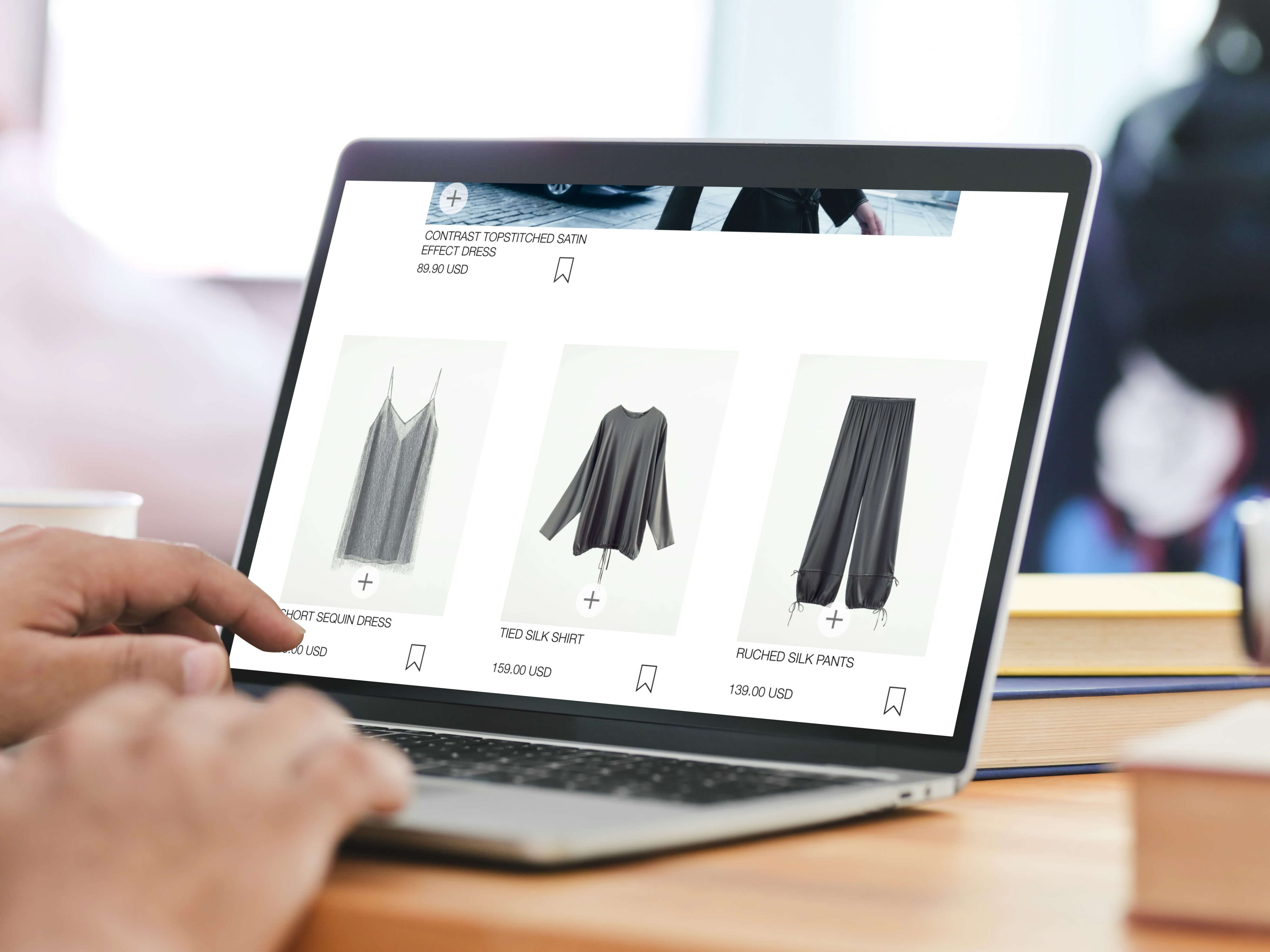
- The format of the pages for their products didn't have multiple pages, and was all on one single page, requiring users to scroll down constantly to see all of the content.
These were some of the issues that I had aimed to improve in this project. I wanted to make the site more UI friendly, while also maintaining the same style the original site had. I then created the low-fidelity wireframes for the new website layout, trying to adjust some aspects and areas that were flawed in the original, and did some user testing, having the user go through the current site they had, and the low-fidelity wireframes. After some feedback and info gained from the user testing, I designed the high-fidelity prototype, and did more user testing with the prototype, to see if the user journey was more clear on the prototype than the actual site.
Conclusion
I would say this project turned out pretty smooth for the most part, and I am happy with how the improved website layout turned out in the end. My only issues with it would be that I feel like there could be more wireframes in the prototype to show more of what the new layout could look like. Otherwise, I am happy with this.
Mockups