Treasure Island Book Cover
This project shows the process work and final design for the remade book cover design for the story treasure island. This is meant to be a reimagining of the cover for the book, while having it still fit the theme of the book it is based off of, using matching typography and colors.
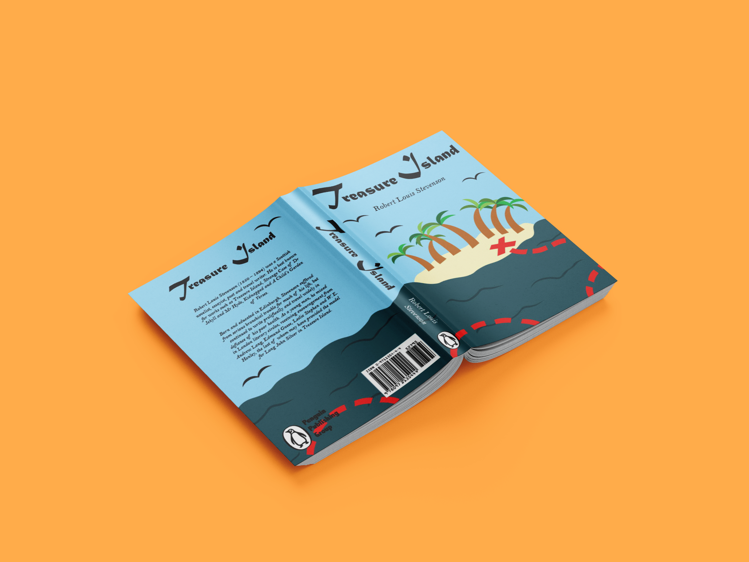
Full Cover
With the front and back cover made, the spine for the book was initally a solid color, but after some feedback, I decided to make it so that the spine's design connected the front and back cover together, so that it feels like one cohesive image across the cover, and fits with the theme of the book.
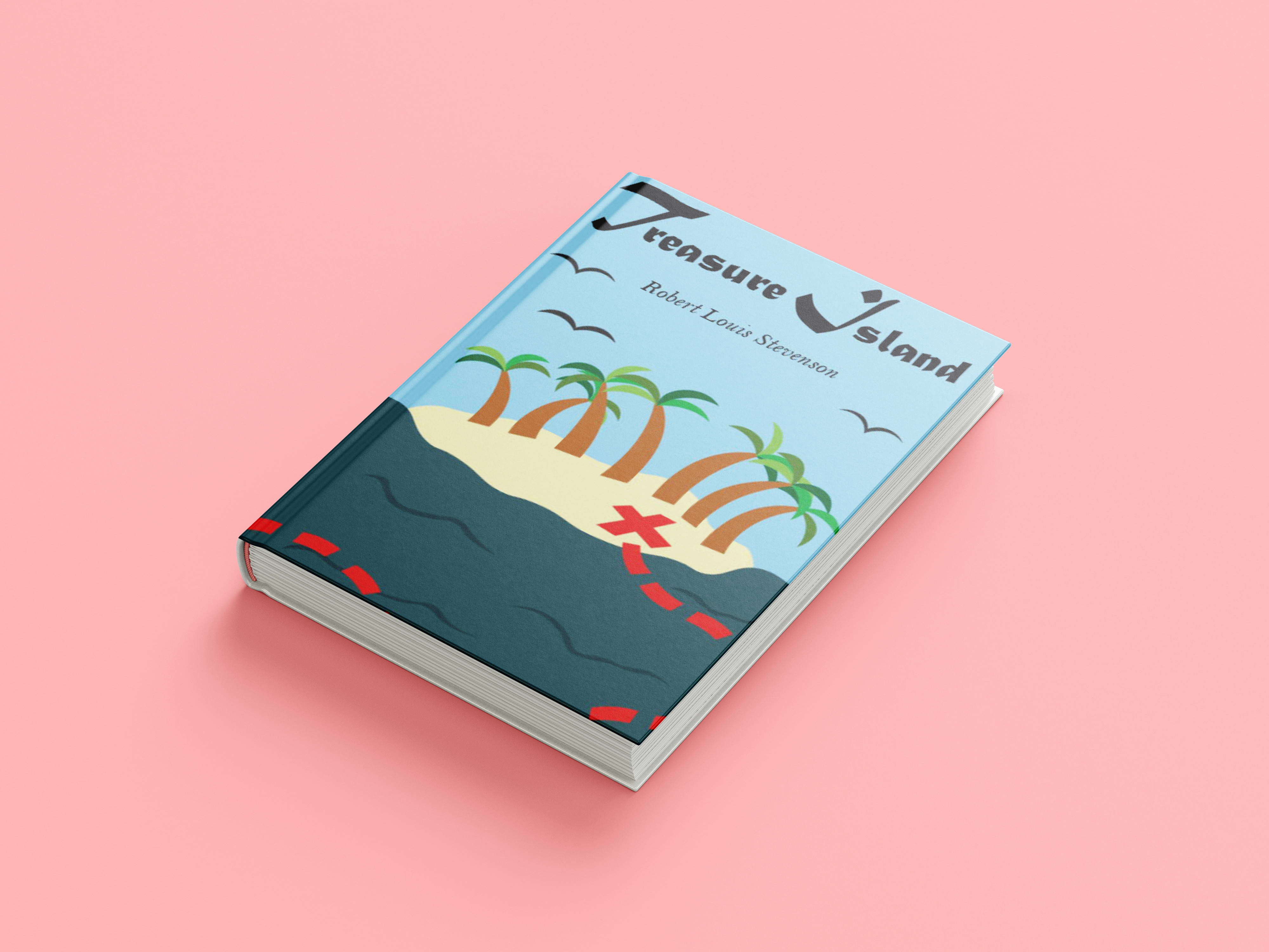
Front cover
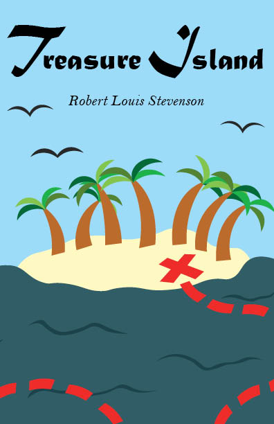
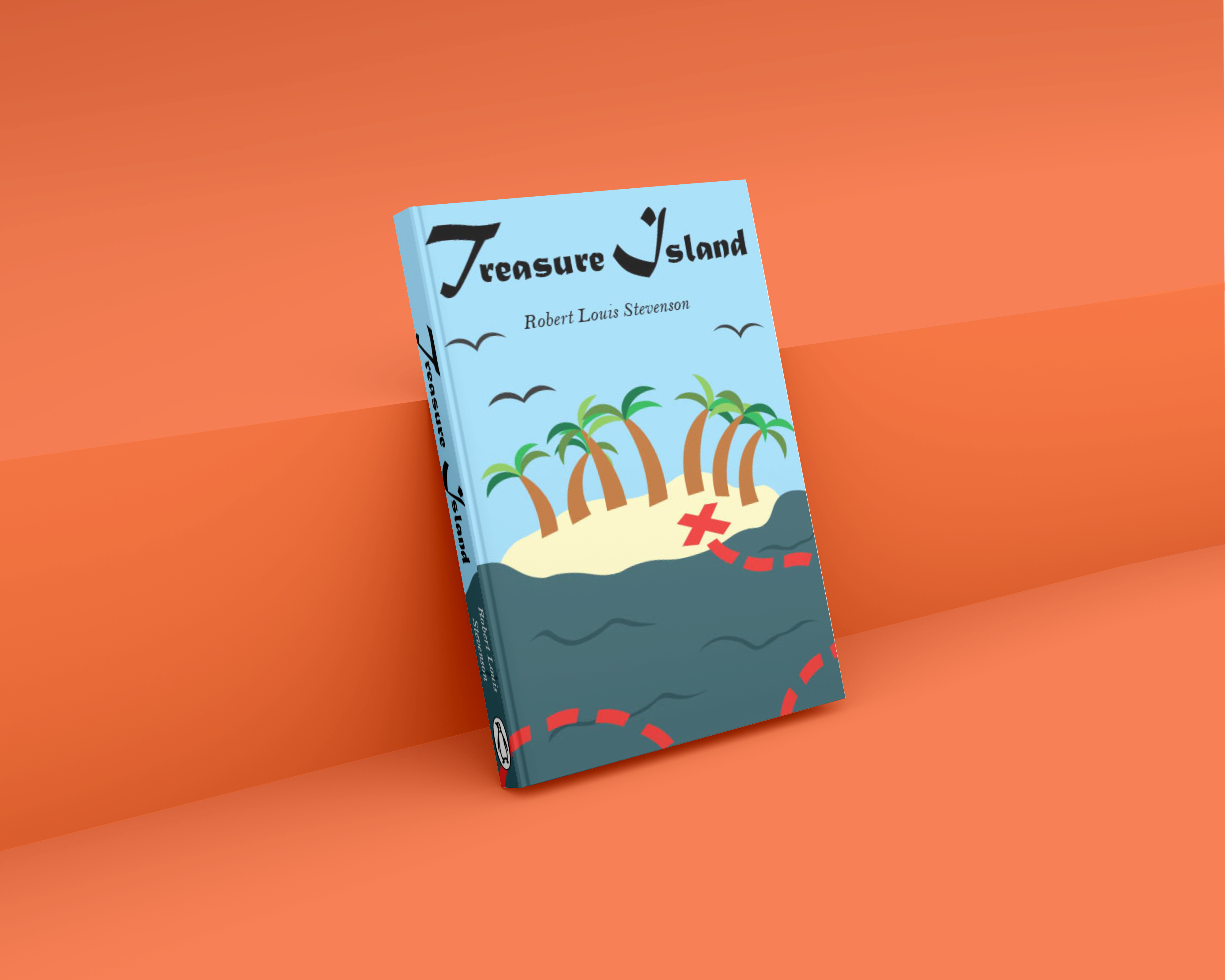
For the front cover, I chose one of the initial sketches I had drawn as a basis for the front cover, and as I designed the cover, I made some minor changes from the inital sketch, and added colors and typography. I used desaturated colors that fit in with the setting and theme that the book's story is based off of, and typography that went well with the theme of the book as well, mainly script and serif fonts.
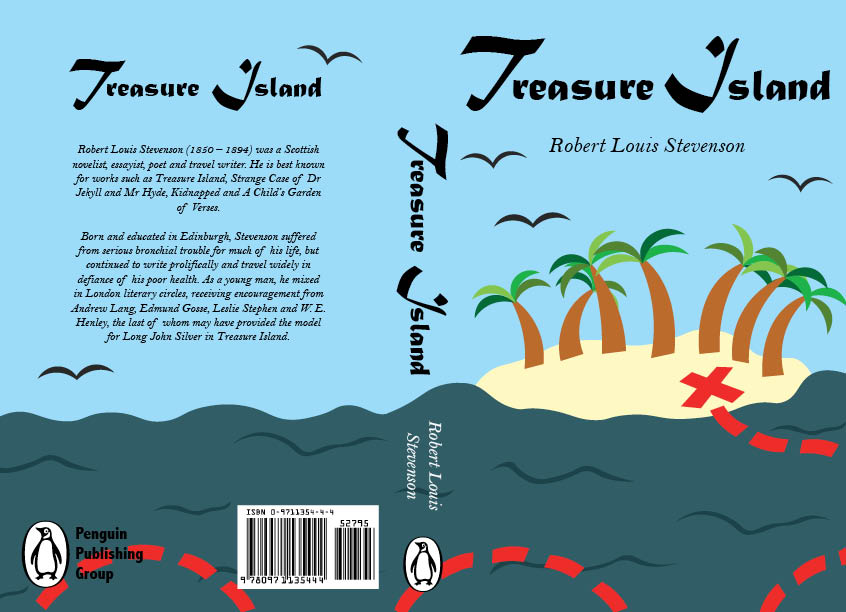
Back cover
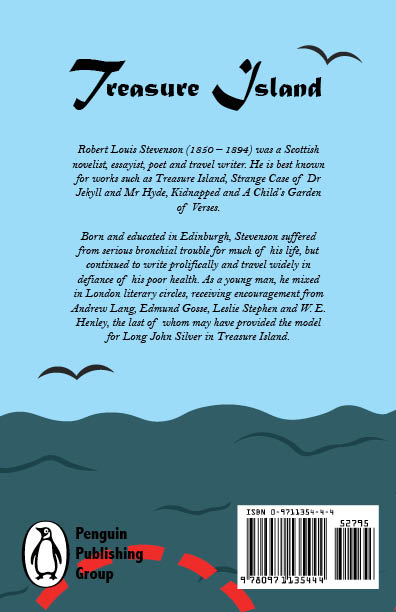
For the back cover, I had wanted to make it be similar and feel connected to the front cover of the book, so I made it an ocean similar to the front cover, except without the island on the back cover to make the author's note on the back more clear to read, and slightly less detail to make it less cluttered for more focus on the author's note.
Sketches
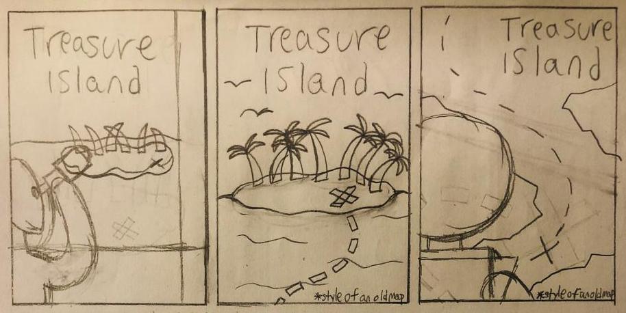
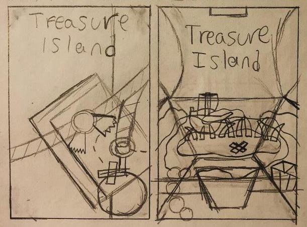
When sketching out the initial ideas for the cover of the book, I wanted it to match the theme of the book and its story, which was pirates, so I sketched out front covers with pirate and adventure themes, including one looking like a leather journal, which would fit in with the era of pirates, and islands with a red X, since that is what is commonly associated with pirates. I also had the idea of making the cover look like an old map from centuries ago, being yellow-ish and worn out, however that idea wasn't implemented in the end.
Conclusion
This project ended up going by pretty smoothly, as I think the design for the cover is a solid and creative idea, and I do think that the colors and typography for the cover fit as well, with the red dotted line and x contrasting the desaturated colors well. Although, I do think a major challenge was choosing the typefaces for the cover, as there were many fitting script typefaces that could have been used, and I do think the typography could have been adjusted on the cover as well. However, as it is now, I am happy with this project.
Mockups
.png)